Corpse Run 600: Nothing on the menu
Awwwwwww man, strip 600, yo!
I LOVE ARBITRARY MILESTONES!
…but there’s something I hate…
I HATE CRAPPY MENUS THAT DON’T MAKE SENSE!
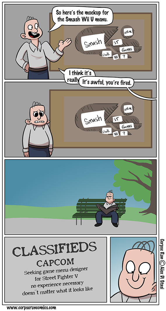
So the “smash” part of the Smash menu really means VS Mode, the classic mode from previous Smash games is located in “Games & More” which is… dumb. There’s no reason for the different size of things, there’s no rhyme or reason to the color coding…
…it’s a mess.
It was the worst menu until Street Fighter V came along with it’s buttons that don’t do anything yet and differently sized tabs that make the selection box warp around the screen because you never know what’s directly left or right of your current location.
What the H?


I mean… Sakurai’s wife designed the menu apparently.
Yeah it was designed by Sakurai’s wife. I can see why people might think it’s a mess, but honestly I love the aesthetic of it.
Both Smash and Kid Icarus Uprising.
I agree the way important options are “hidden” didn’t make sense.